The Montclair Cooperative School, located in Montclair, NJ, is a community of learners (nursery through 8th grade) where children are invited to take risks, question, explore, discuss, interpret, and create. We discover ways to apply learning effectively in solving problems and constructing new knowledge. In an effort to broaden their geographic reach and student demographic, the Montclair Cooperative School is changing its name to Bright Mountain Cooperative School. As such, they need a new logo and would like to use this opportunity to roll out a complete rebrand and deployment of new promotional materials.
deliverables
Logo Stationery Two Brochures Viewbook Brand Guidelines
the rebrand
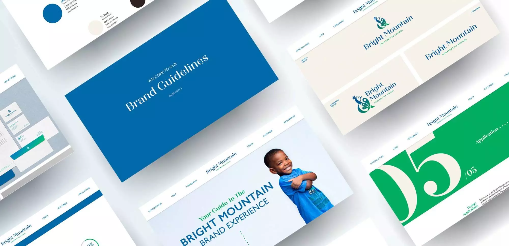
The rebrand of Bright Mountain Cooperative School features playful circles, repeating patterns, bright colors, and the mentality of a kid being a kid. The rebrand involved designing a new logo, stationery, brochures, viewbook, and brand guidelines so that the brand can remain consistent through time. The goals of the rebrand were to increase enrollment outside of the Montclair area, increase diversity, and position the school as being a leader in progressive education.
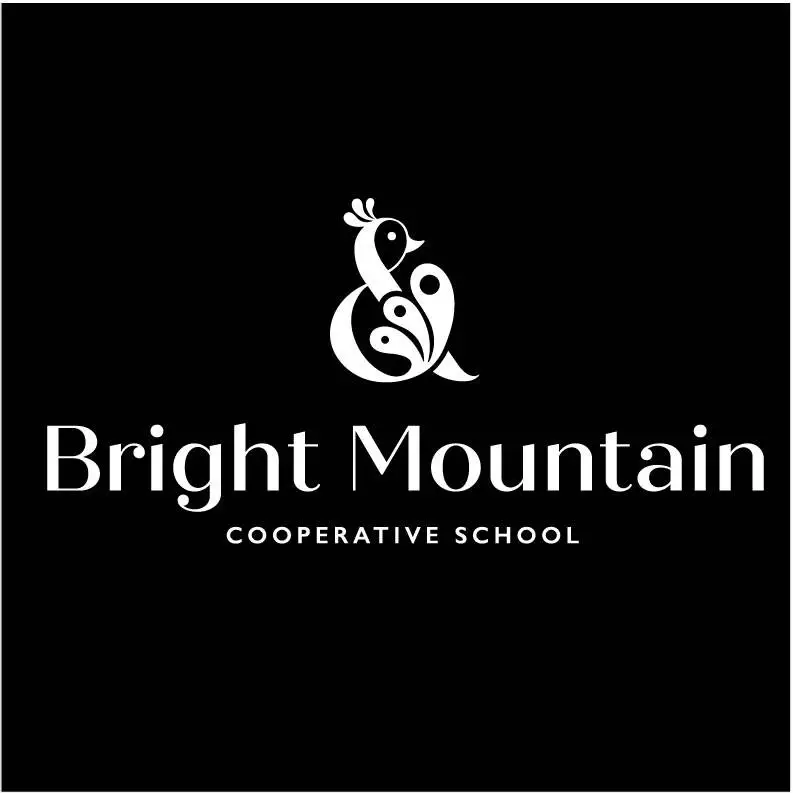
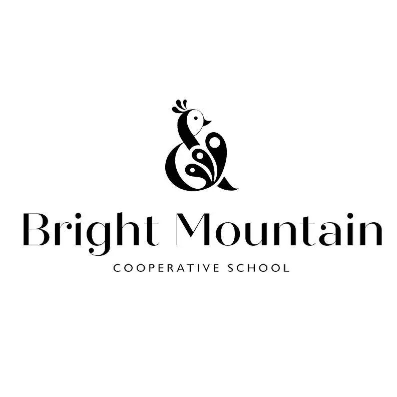
The first step of the rebrand is the inclusive mark. The new Bright Mountain Logo is composed of an ampersand and a peacock. An ampersand is an inclusionary mark and is the visual representation of the word “and”. The peacock is a very symbolic animal across a wide variety of different cultures. It represents self-expression, integrity, freedom, and guidance. The logo features an ampersand peacock with a green to blue gradient, which emphasizes the progressive nature of our school. The logotype is Quiche Display is a high contrast san serif. The typeface is as uniquely modern and expressive as the school itself.
Print Collateral
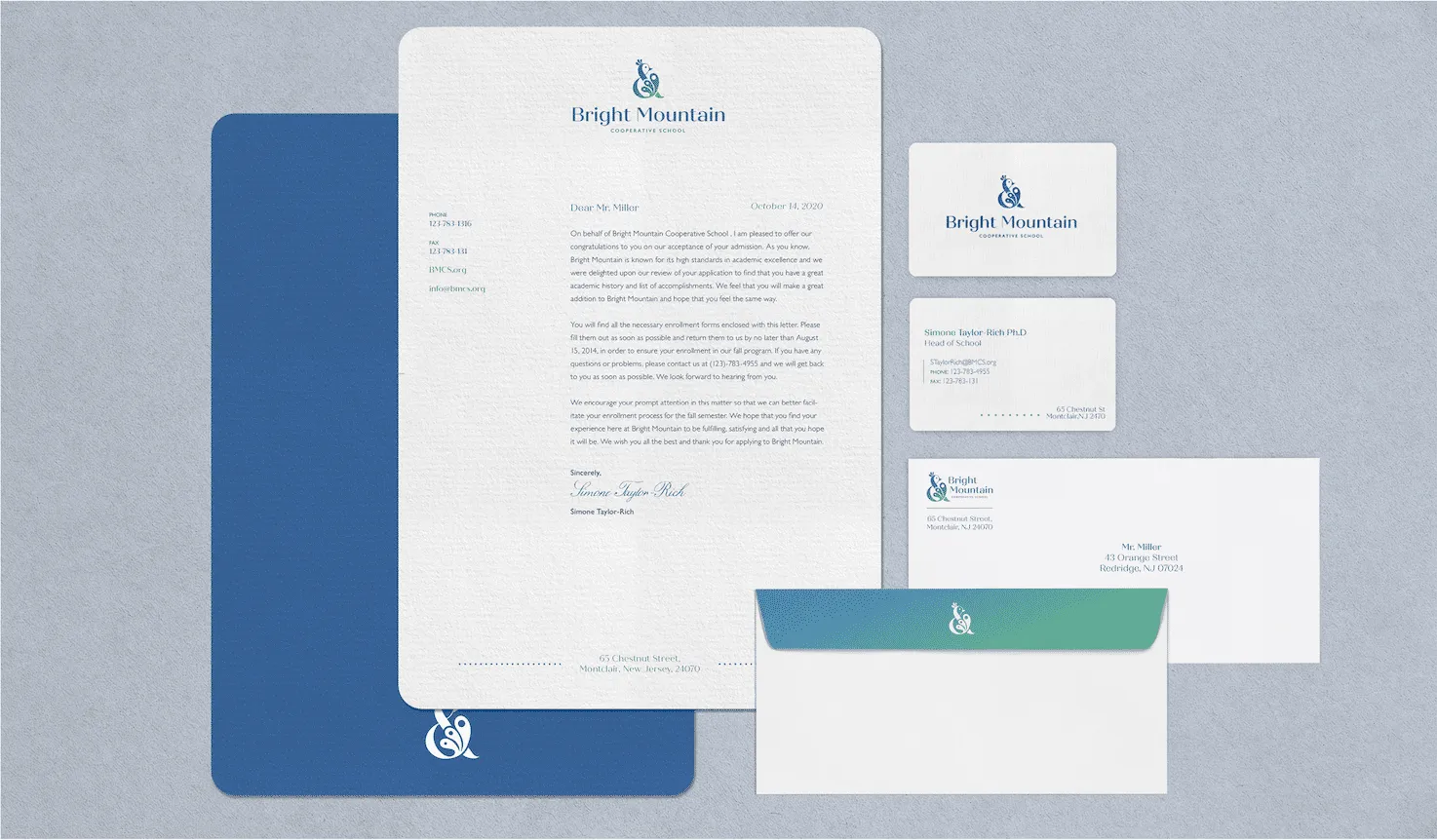
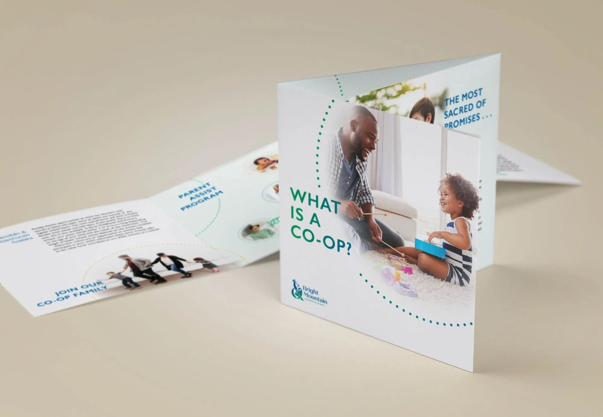
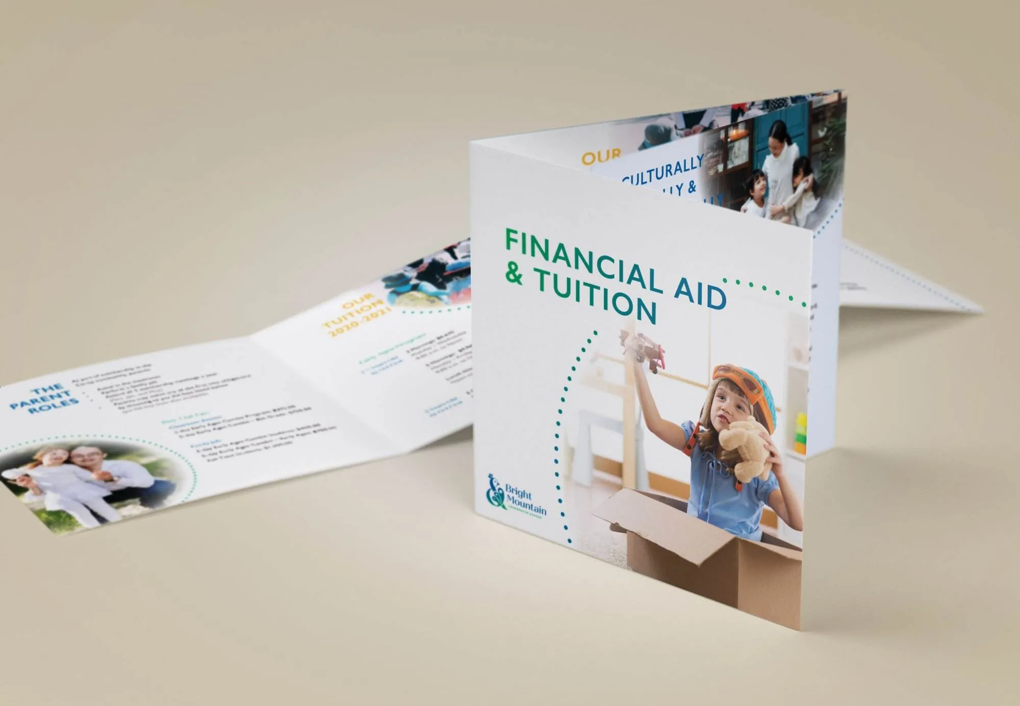
All elements of the Bright Mountain brand place an emphasis on tactile quality. So that from your first tour on campus and meetings with students and staff to opening your child’s acceptance letter at your kitchen table, the brand experience is felt. Stationery is very important as it tends to be one of the first touchpoints potential families will have with the brand. With this in mind, the stationery packages has tactile elements such as linen paper and foiled business cards. The stationery features wide margins, rhythmic dot patterns, and bright colors.
The brand experience is carried over into the brochures through the repeating dot patterns, friendly imagery, wide margins, and bright colors with friendly gradients. These would most likely be a second touchpoint, so they contain more information to help the potential family learn more about Bright Mountains’ cooperative nature as well as the tuition and fees associated with attendance.
Brand Guidelines
Bright Mountain brand guidelines should only be used internally. The brand guidelines is a website that provides all the structure needed for recreating the brand, as well as all of the elements needed for this, as all brand elements can be downloaded from the site.