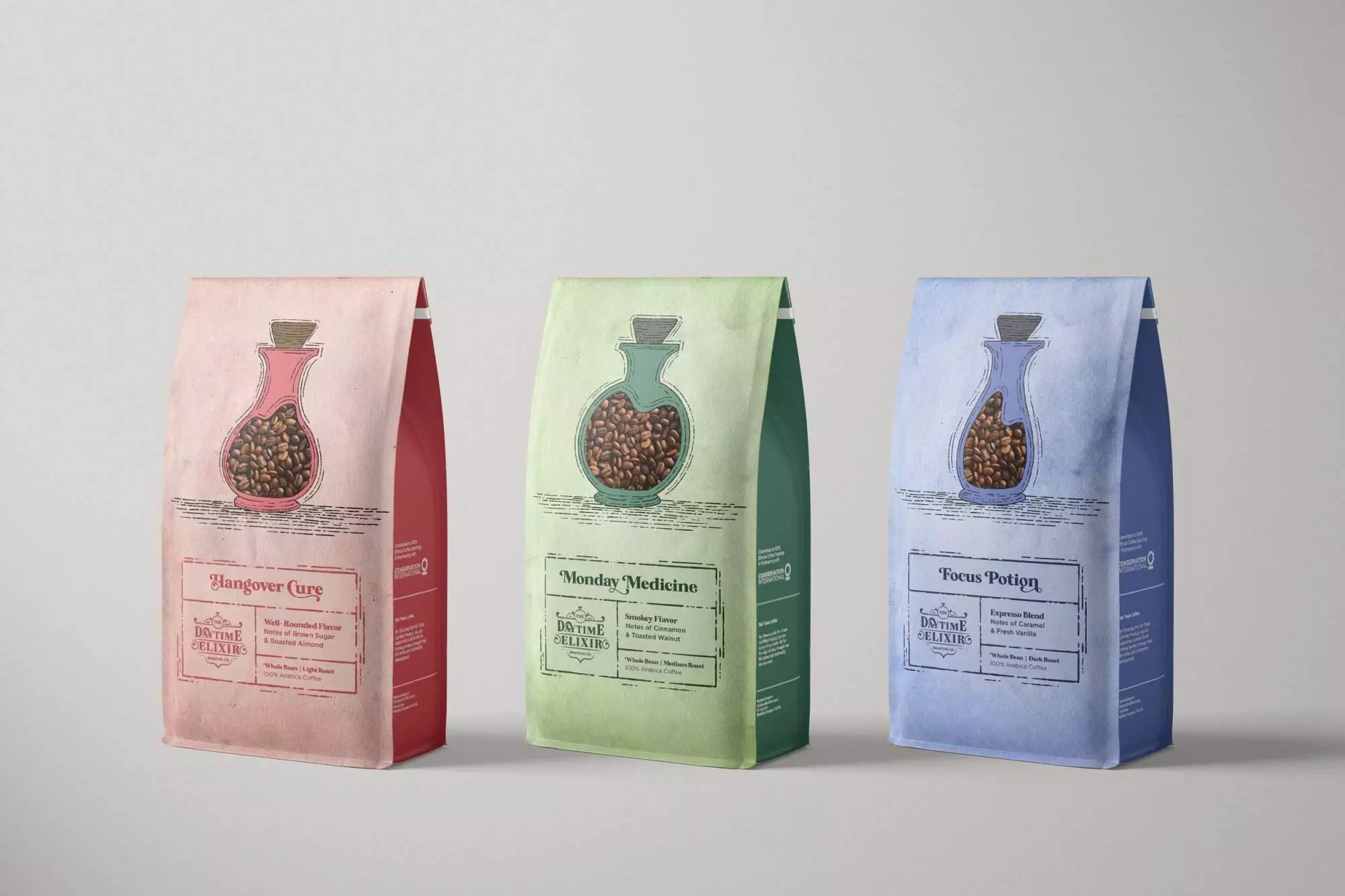
Daytime Elixir Roasting co
Packaging for High End Coffee Company
Project background
The project involved a full rebrand (including name) of Philly Trade Roasted. The company specializes in small-batch 100% Arabic coffee, roasted to order for maximum freshness. That being said, their design is lacking. They would like their coffee to compete in a larger market and because of this they are looking to rebrand. The ultimate goal was to rebrand Philly Trade Roasters as a theme-based high-end nationally known coffee roaster able to charge an average of $2+ per ounce of coffee.
deliverables
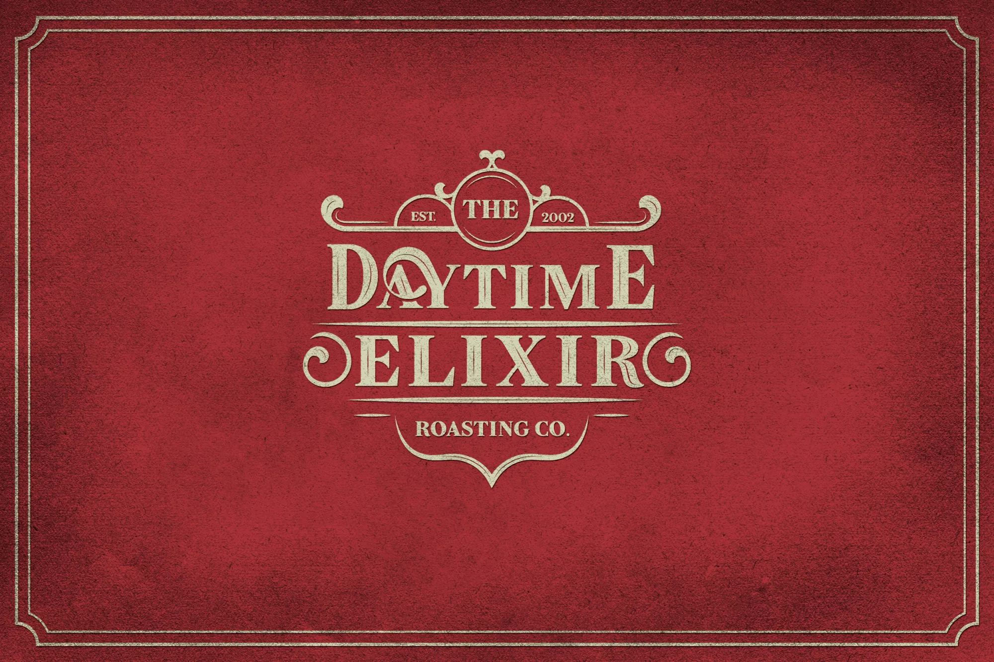
Logo
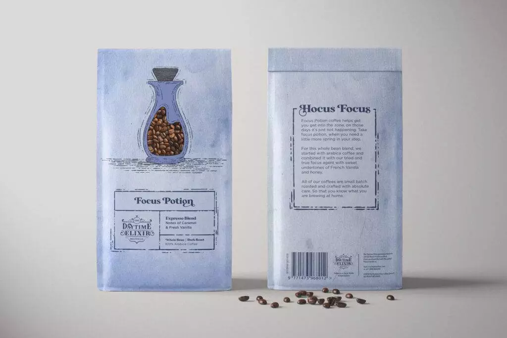
Coffee Bag Packaging
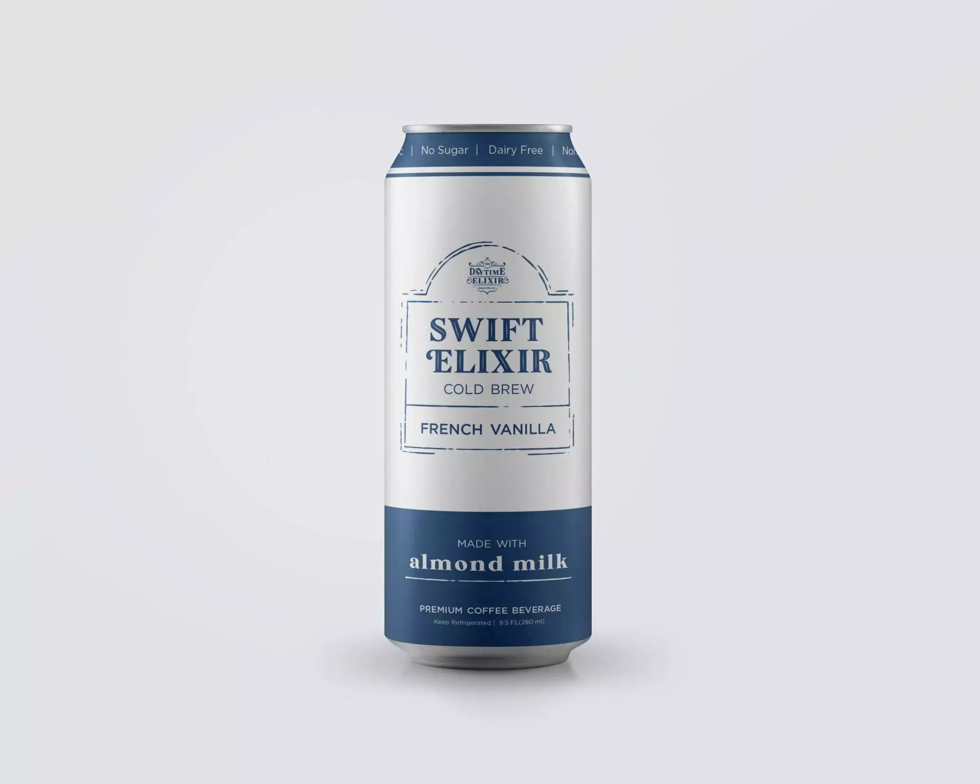
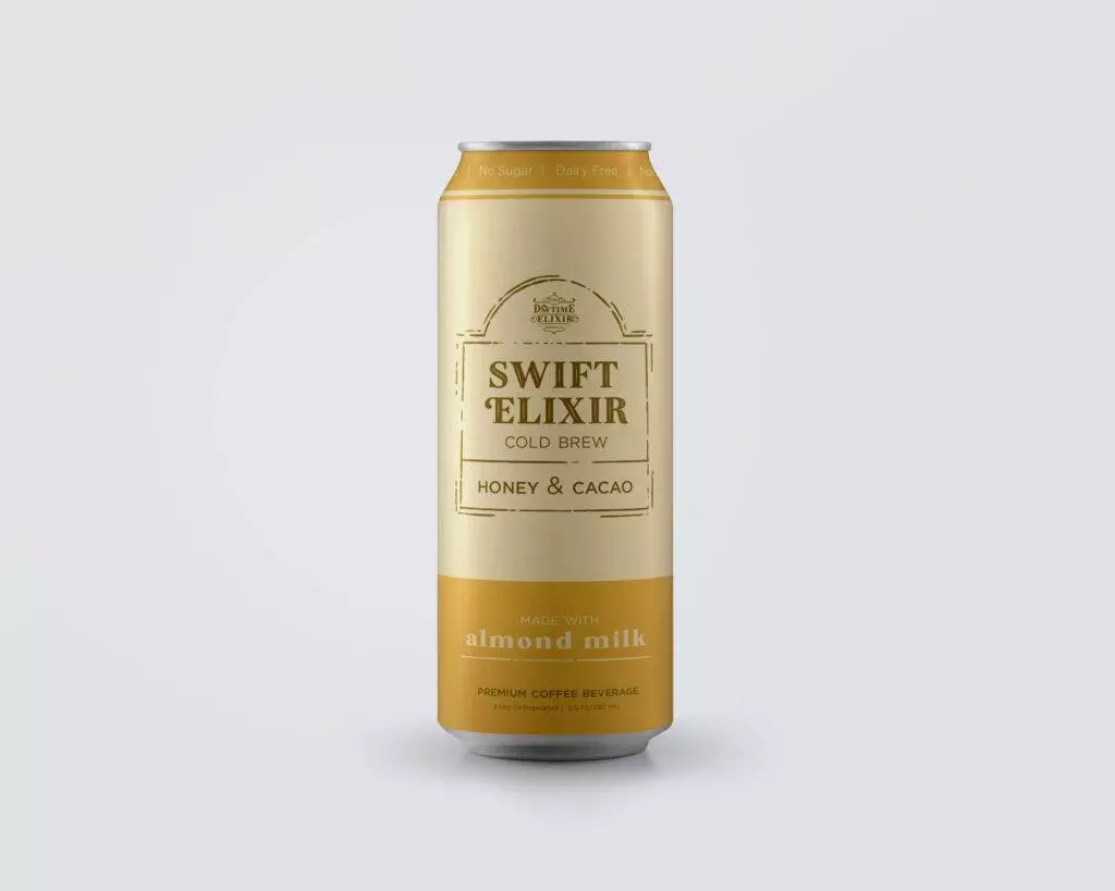
Canned Coffee Packaging
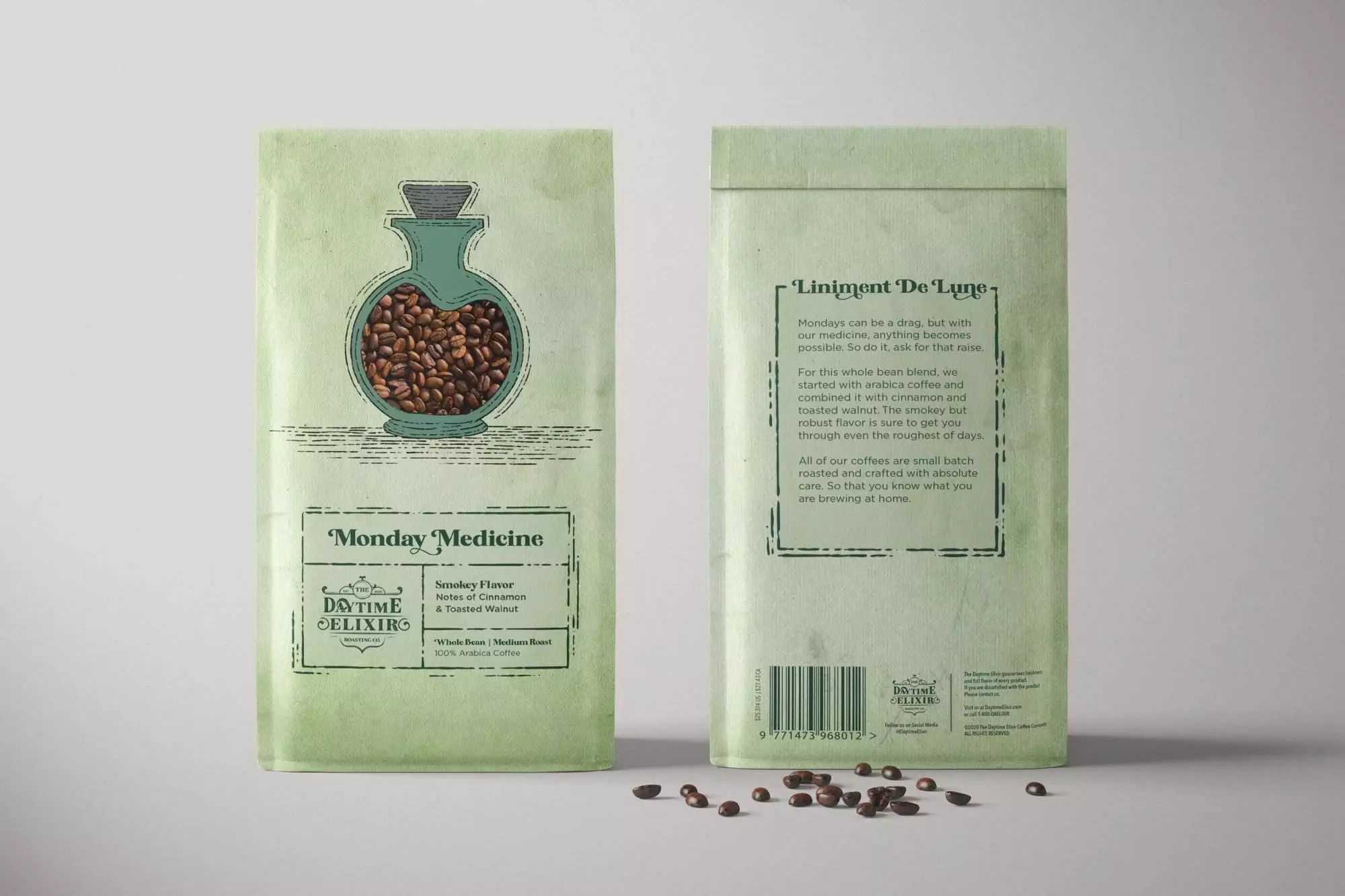
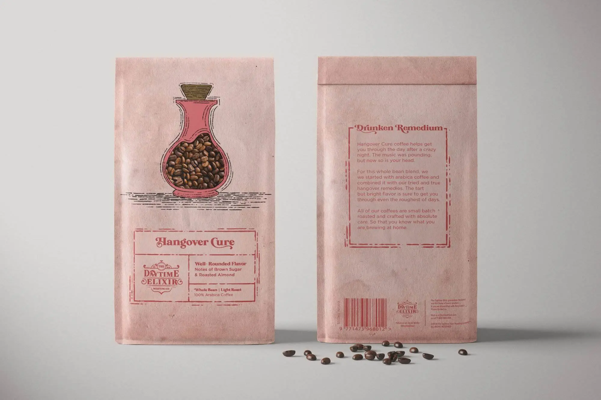
the Logo & packaging

The creative Process
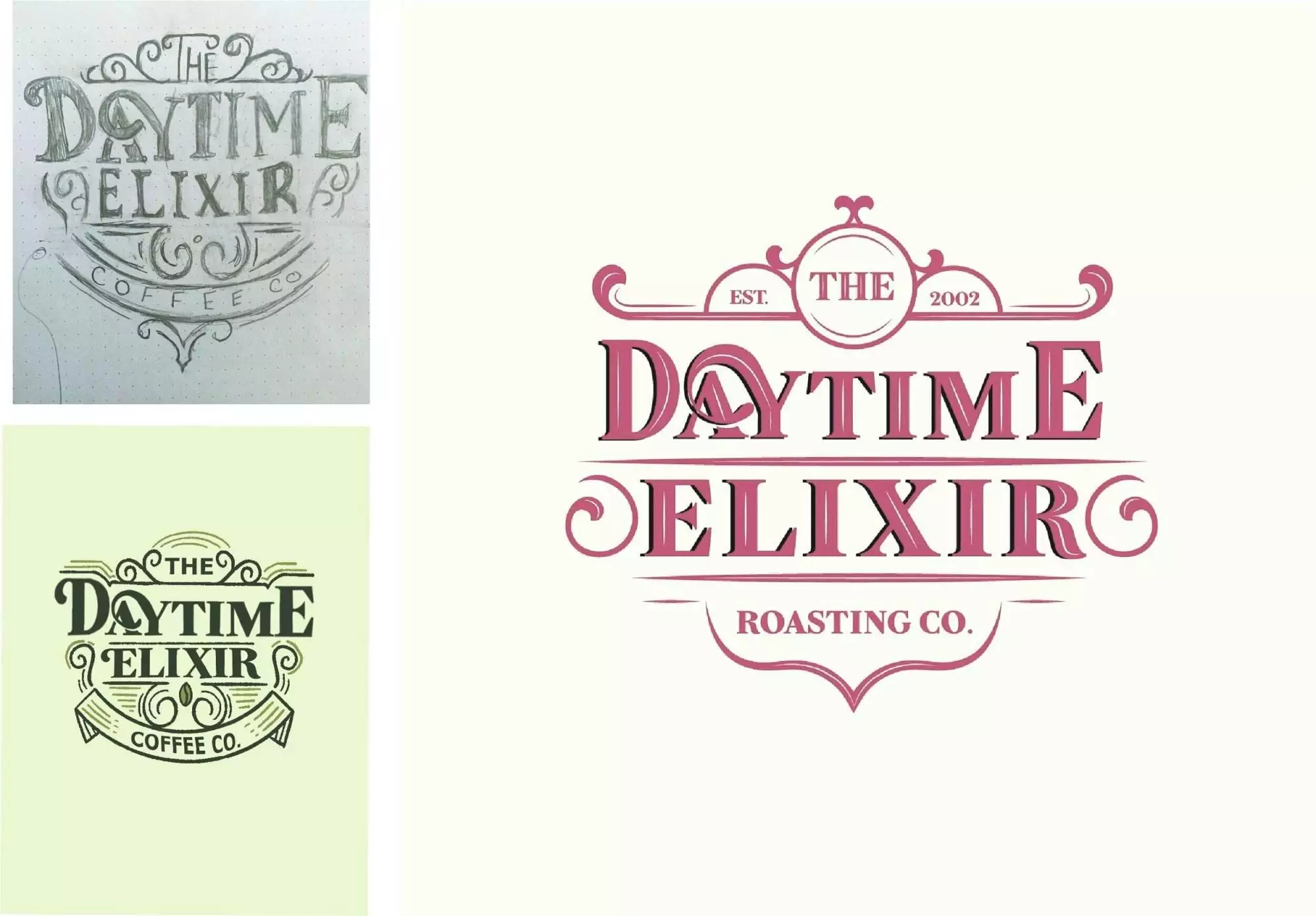
Let's Start Thinking & Sketching
For the logo design, I took a vintage lettering approach. The typeface is a modern serif, yet still includes flourishes to help give an apothecary feel. When designing the logo I began with circular shapes, banners, and woodcut texture. These elements were simplified down to lines and arches to give a more modern and sophisticated feel. I wanted to emphasize the idea of coffee being a cure to your everyday problems. In order to achieve this, I researched vintage apothecary bottles. From there I illustrated three bottles with varying widths. The center of the bottle, where the “potion” would be, is a die-cut that shows the coffee beans inside the bag. This further emphasizes the idea of coffee being a cure. The layout of the bag itself is set on a grid, with a golden ratio.
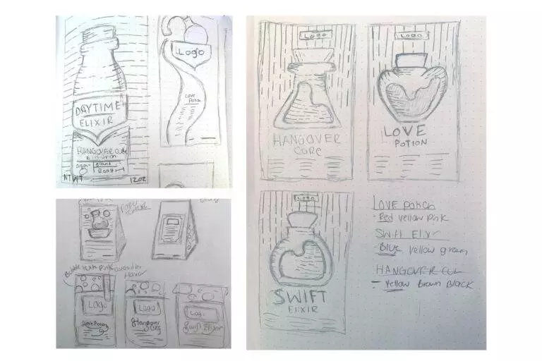
sketch with me!
Hit play on the video! Don’t worry its only 30 seconds
