Teaology

Cocktail Subscription Box

Project background

Teaology is a subscription-based tea company that harmoniously blends tea and alcohol. It elevates the widely enjoyed beverage of tea and gives it an adult spin while still remaining closely aligned with the tea & health-conscious community. The infusion of the tea leaves helps to give the alcohol an additional flavor boost without the boost in sugars.

deliverables

Logo
Subscription Box
Tea Sampler
Informational Materials
3 Tea Containers
Infusion Bottle & Infusion Box
Website

teaology brand

For this project, the client wanted to go with a “tiki-style design” that involves every cocktail on the menu each having its own graphic. When working on these illustrations, I knew I needed to highlight the glassware, garnishes, and type of ice for each drink. These attributes are crucial to the design, as they are all critical to the guest’s enjoyment and overall experience of the beverage. To better highlight these unique attributes, I decided to go with a figure-ground illustration approach. This provides a way to display what makes each cocktail special, while still reliably conveying the color of each beverage. After finalizing all of the illustrations, I began integrating them into the timeline format I had built. Once the design was finalized and approved, I created a limited edition poster and an opening Instagram graphic. These elements would be used in the initial promotion of the new menu.

Brand Colors

The brand colors are related to the process and each element related to making. a teaology cocktail. Hibiscus, Green Tea, and Matcha all relate to the tea aspect of Teaology. Their names reflect the main teas featured in the Vino Teano Subscription box. The colors Vino and Decant relate to the infusion process and the alcohol its self, especially wine.

Besides the relationship to the process of Teaology, the colors1 also relate to color psychology. Greens are often associated with nature, health, and the natural world. These characteristics pulling back to Teaology cocktails being a healthier alternative to other cocktails. Pinks are often associated with nurturing, and comfort, and love; and of course who doesn’t love a good cocktail.

a “tiki-style design” that involves every cocktail on the menu each having its own graphic. When working on these illustrations, I knew I needed to highlight the glassware, garnishes, and type of ice for each drink. These attributes are crucial to the design, as they are all critical to the guest’s enjoyment and overall experience of the beverage. To better highlight these unique attributes, I decided to go with a figure-ground illustration approach. This provides a way to display what makes each cocktail special, while still reliably conveying the color of each beverage. After finalizing all of the illustrations, I began integrating them into the timeline format I had built. Once the design was finalized and approved, I created a limited edition poster and an opening Instagram graphic. These elements would be used in the initial promotion of the new menu.

Typography & Patterns

The typography used in the Teaology brand are the typefaces Sofia and Kazimir. These typefaces were selected in order to convey the idea of Teaology being sophisticated yet still approachable and friendly

Sofia is a geometric sans-serif typeface designed by Olivier Gourvat and released through French foundry Mostardesign. It was originally released in 2008 with an updated version made available in 2012 with wider language support and additional OpenType features. It has a warm and somewhat humanistic feel for geometric sans. Sofia is available in an impressive eight weights with matching italics and has over 40 fonts in the family.

Kazimir is a Modern serif style typeface with five weights, from light to bold, with matched italics. The face has slightly narrowed proportions, long extenders, and dynamic strokes reminiscent of the rhythms of transitional serifs. Kazimir is a reworking of book typography of the late 19th and early 20th centuries. Kazimir blends various features of pre-revolutionary Russian typography with contemporary ideas of fashion, form, and harmony.

The Teaology brand uses patterns that tell the story of how to make a tea into a Teaology Cocktail. The icons in the pattern are reminiscent of the logo in terms of stylization. The story that the patterns are telling is that when making a Teaology cocktail you will need water, wine, tea leaves. heat and varying cocktail glasses.


UNBOXING EXPERIENCE

The unboxing experience is a key component of any subscription service. A good unboxing experience can increase loyalty, create a great first impression, increasing the perceived value of the product, boosts marketing content, and tells the brand story. The process of unboxing is a sophisticated post-purchase marketing strategy. The delivery of the product is the final interaction that your brand has with a customer, so you want to leave them with such a positive impression. The Teaology subscription box comes with a subscription box, three tea containers, a welcome card, a recipe booklet, and an infusion card. Teaology also offers several add-on items such as an infusion bottle and a tea sampler.

SUBSCRIPTION ADD-ONS

Many subscription companies use a marketing practice called Add-On selling on their e-commerce sites. The practice of Add-On selling involves selling an ancillary item in addition to the original items being purchased. The ancillary items in Teaology would be a tea sampler and an infusion kit. The tea sampler would function as an incentive for customers to try new teas. The infusion kit is a critical component of the tea infusion process and is mentioned in the informational materials related to the tea infusion process.

Website

The website includes information on the featured teas, tea infusion information, tea education, and featured recipes. The website also has a tea quiz feature that would allow users to discover new teas.

The creative Process

Let's Start Thinking & Sketching

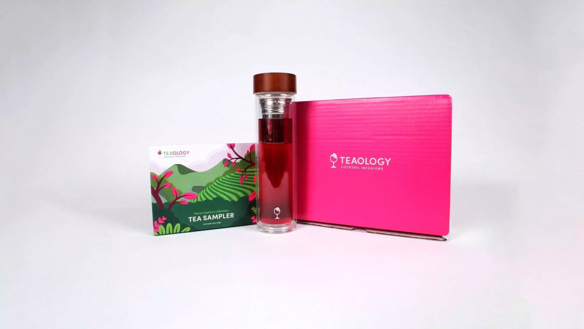
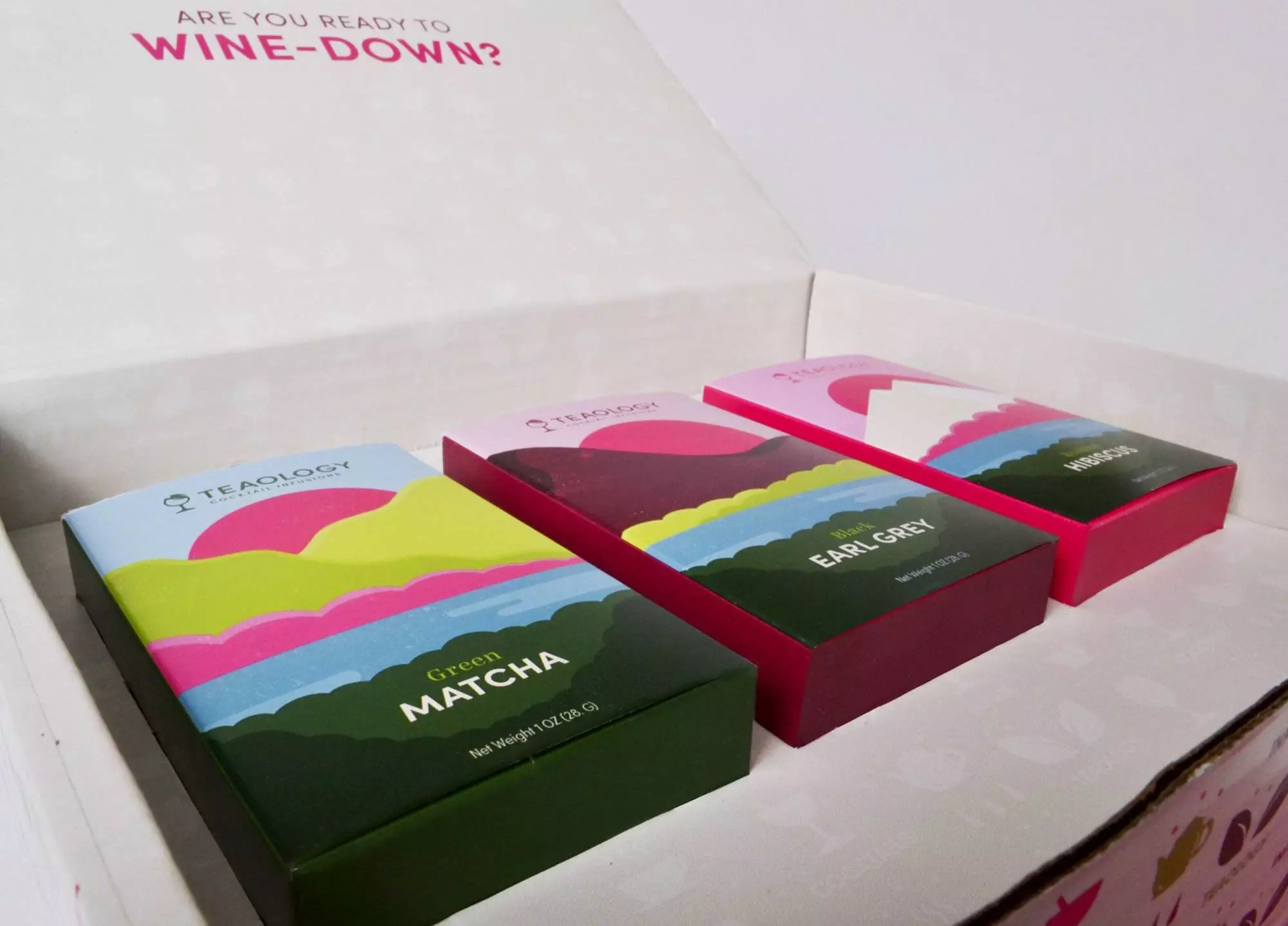
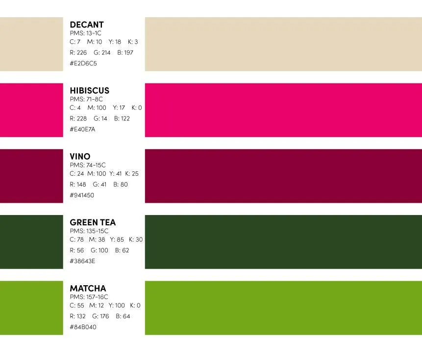
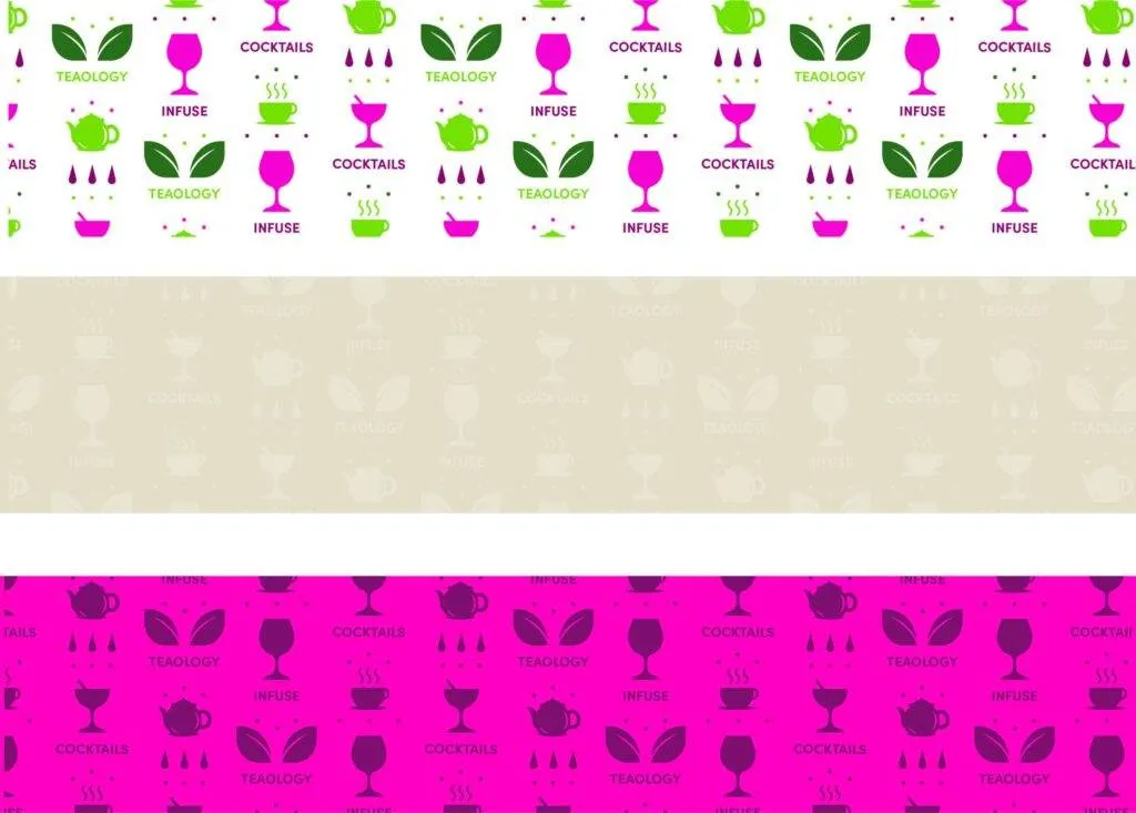
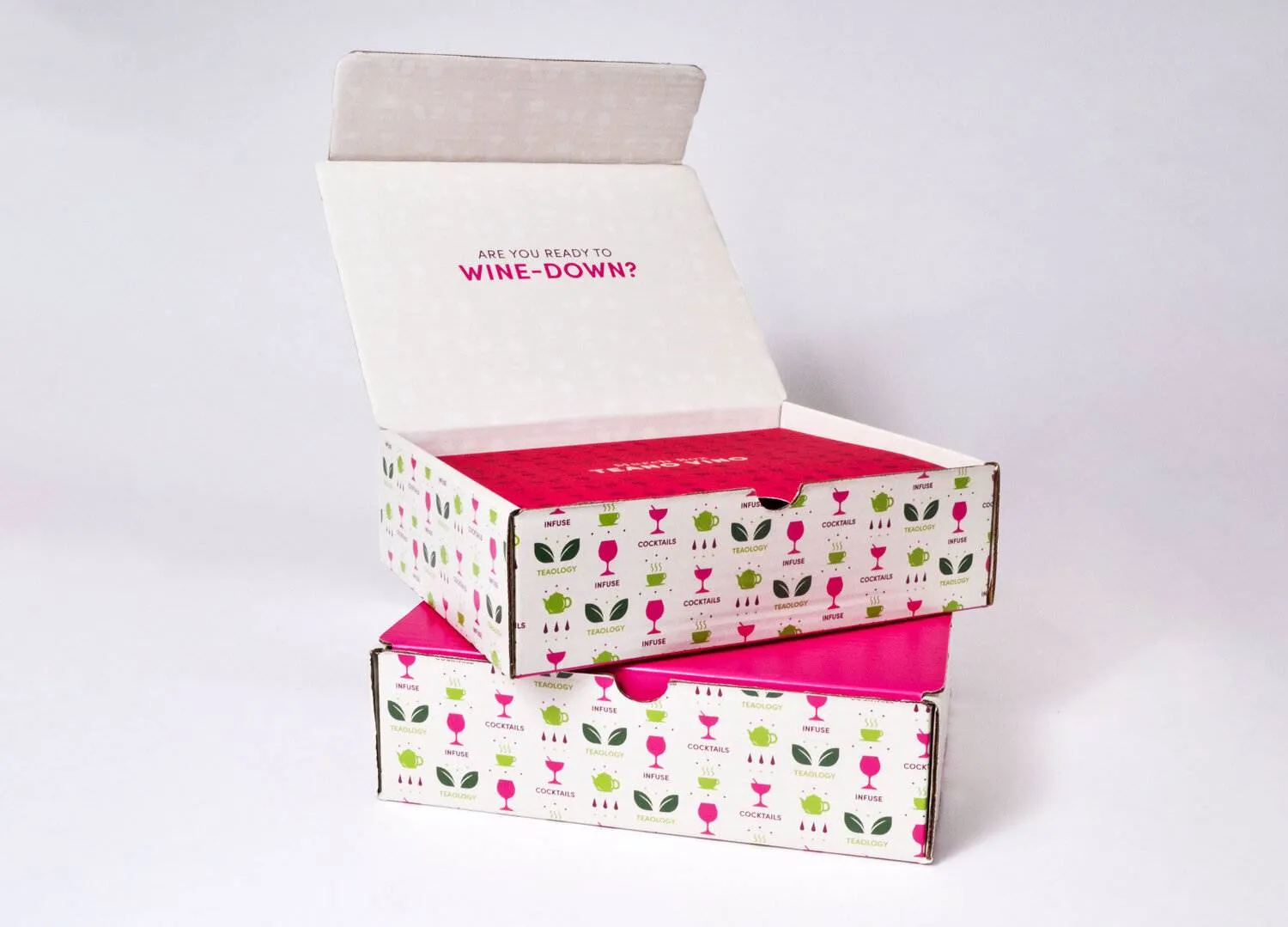
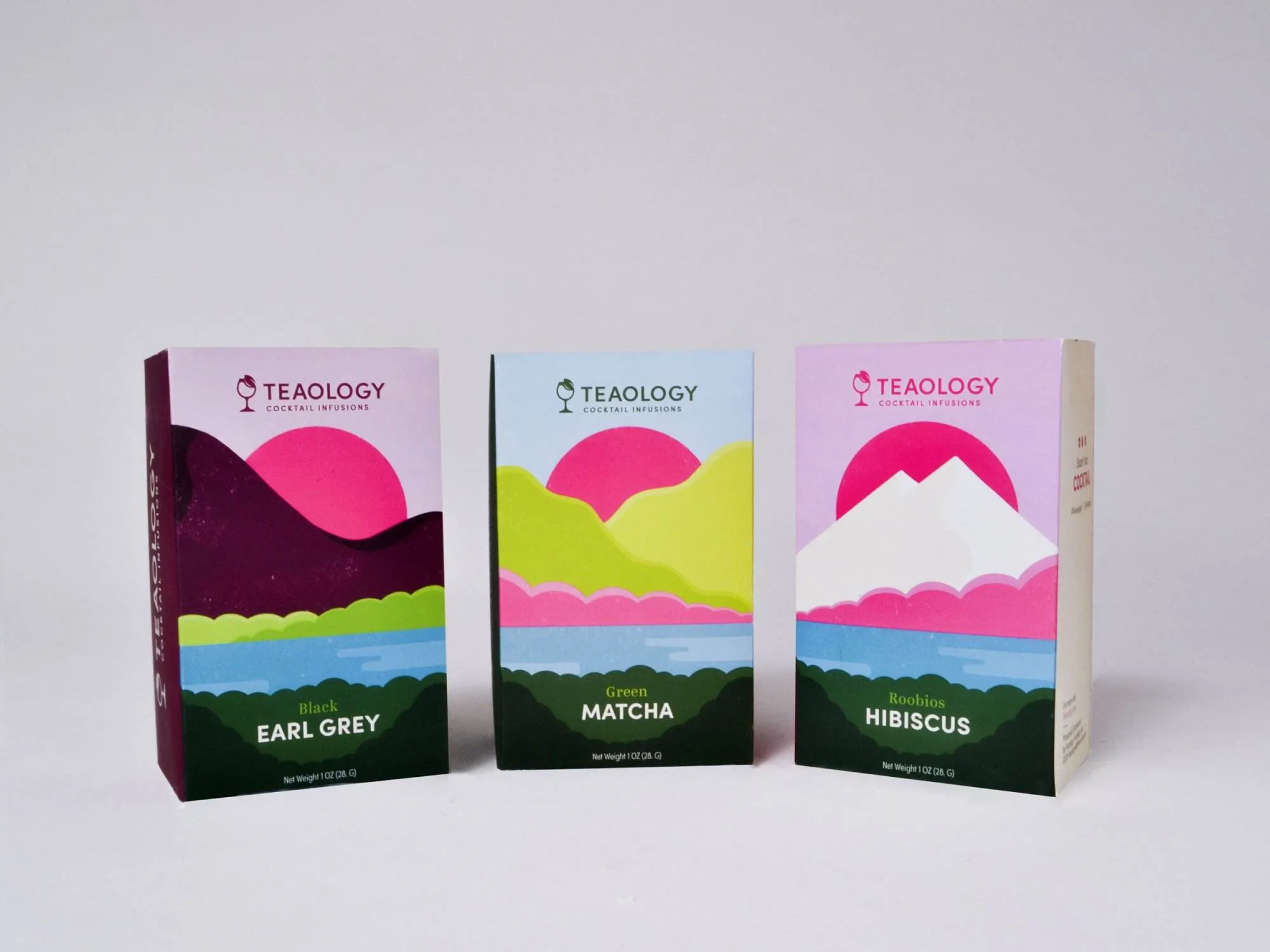
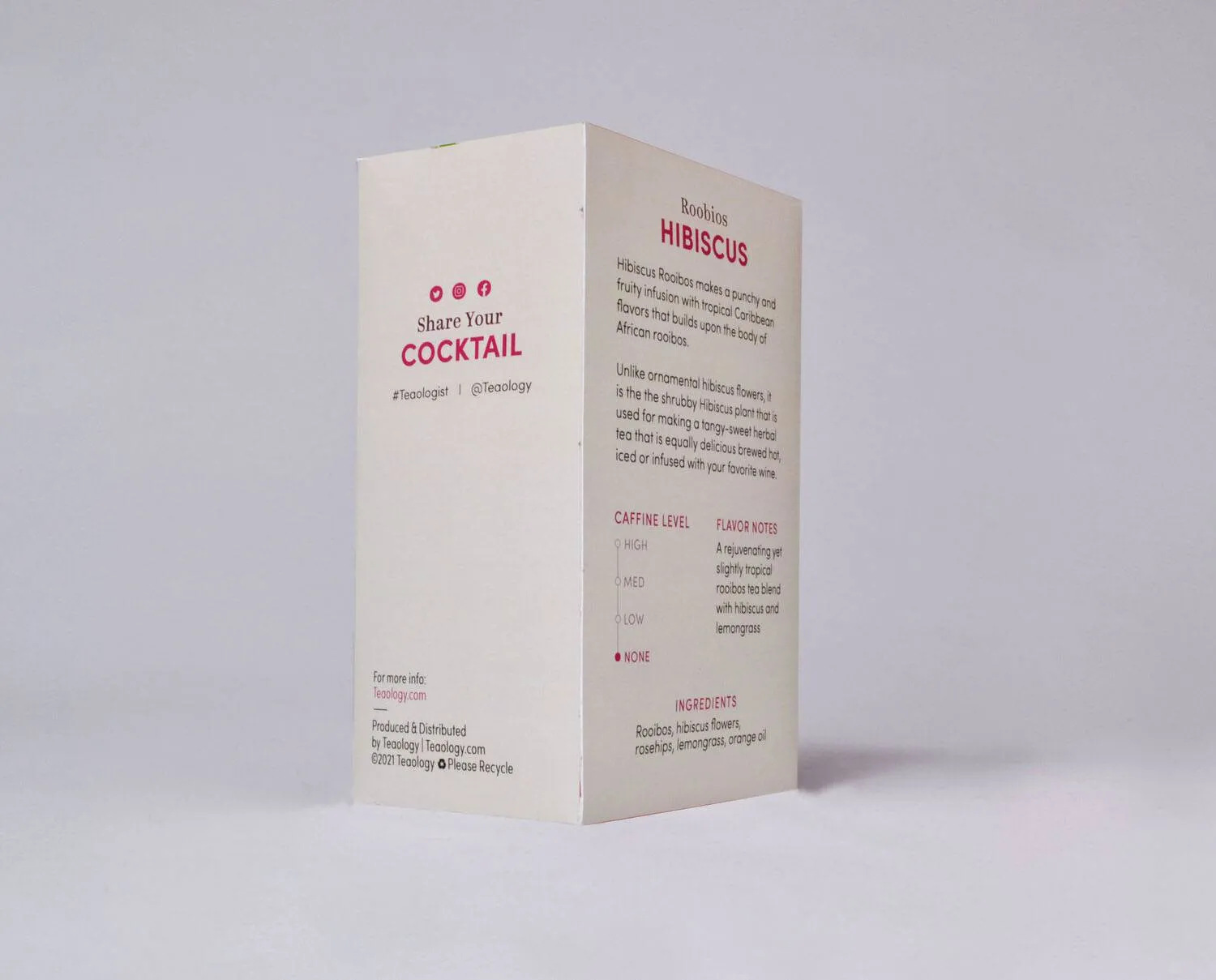
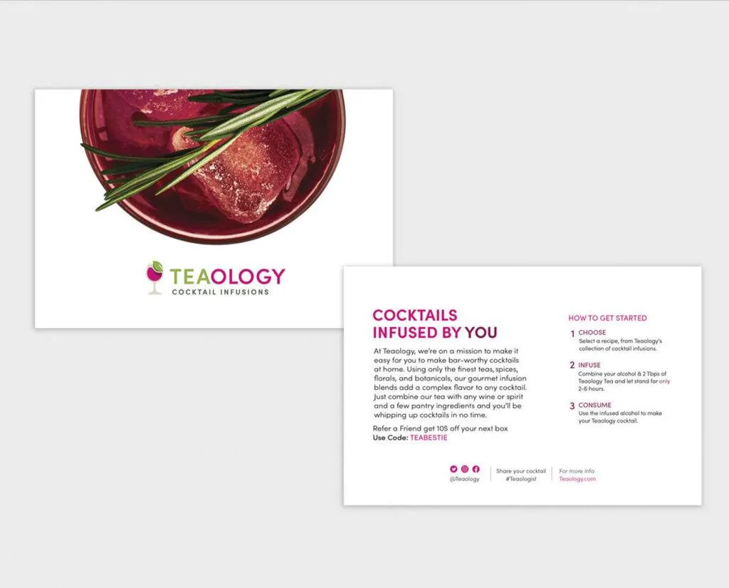
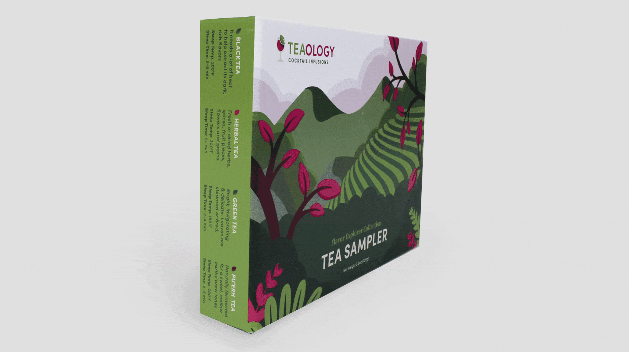
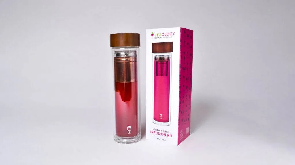
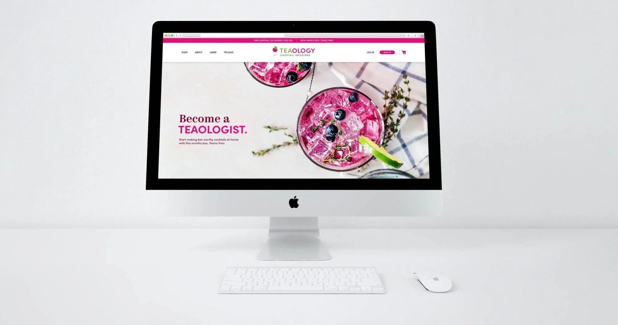
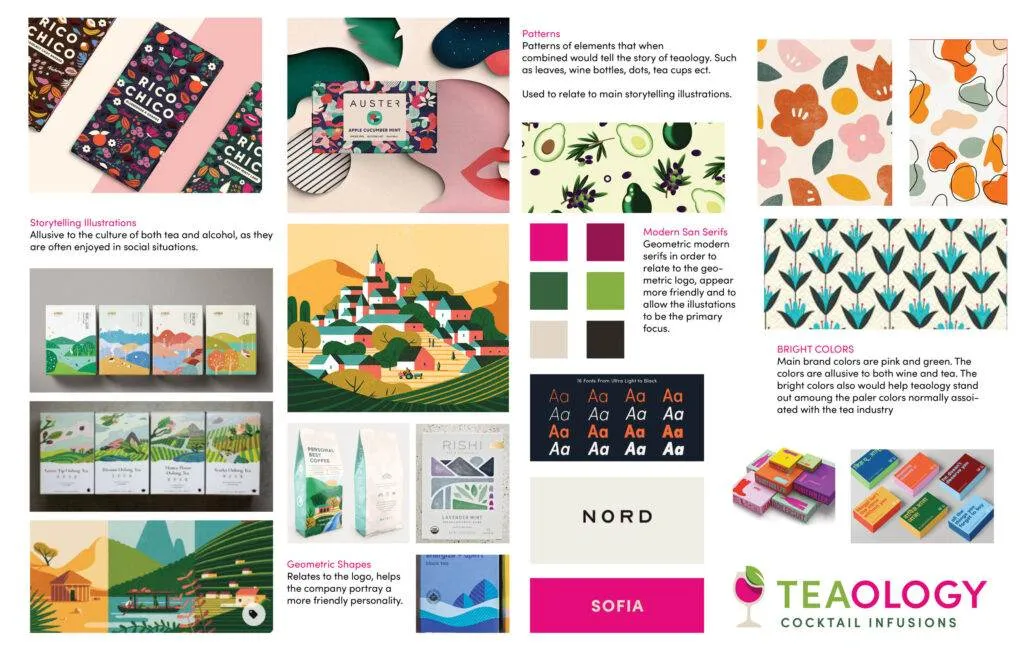
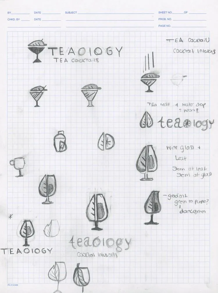
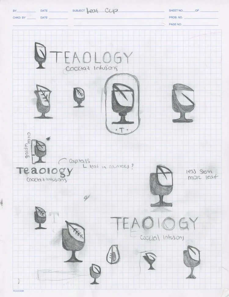
During the Idea generation phase, I considered all of the words I wanted to be associated with Teaology, many of these words involved the idea of infusion or mixing. I also considered the actual process of how someone would make a tea-based cocktail. Because this is such a niche idea I wanted to make it clear how Teaology comes together to make the cocktails and thus decided to focus on storytelling illustrations, patterns, geometric shapes, geometric san serifs, and bright colors. The core elements I focused on were a wine glass and a tea leaf. 

 
tea branding moodboard

sketch with me!

Hit play on the video!  Don’t worry its only 30 seconds

Play Video